
Desk of Craig


10,000 Steps
How might we provide users a seamless mobile app experience that will enable them to enjoy the 10,000 steps program without having to navigate to the website?
What is 10,000 Steps?
10,000 Steps by Central Queensland University (CQU) is “a free physical activity program here to help you move more”.
10,000 Steps is a platform recognised around the world, providing support and encouragement to users looking to maintain or increase their activity levels. Jointly with businesses, councils and state departments they have established an active user base that utilise the platform to track their steps on a daily basis.
The application supports individuals, organisations and communities to incorporate more activity each day through evidence-based tools and resources. Pairing this with novel ways of goal-setting and encouragement through team based competitions, 10,000 Steps gives users an opportunity to track their activity differently.



What were we doing?
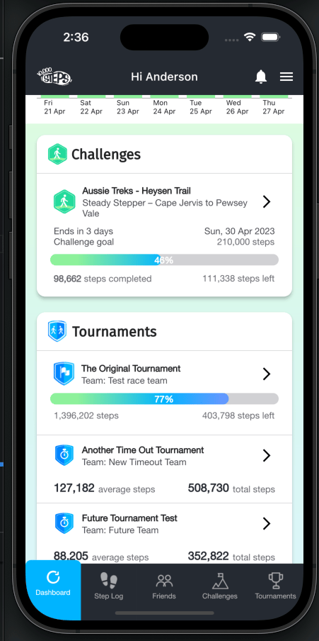
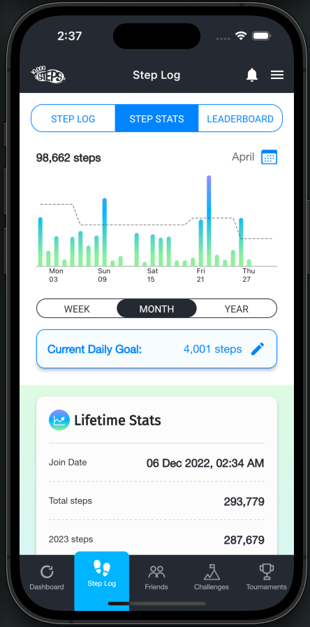
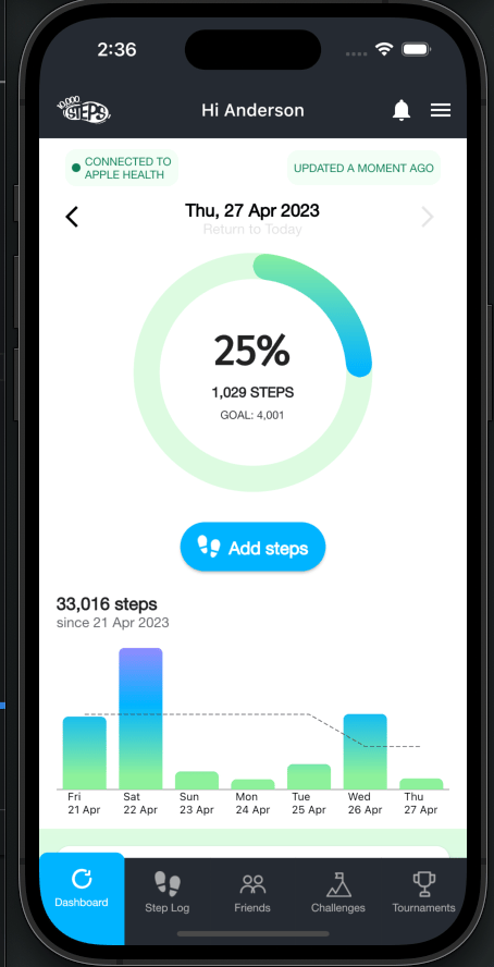
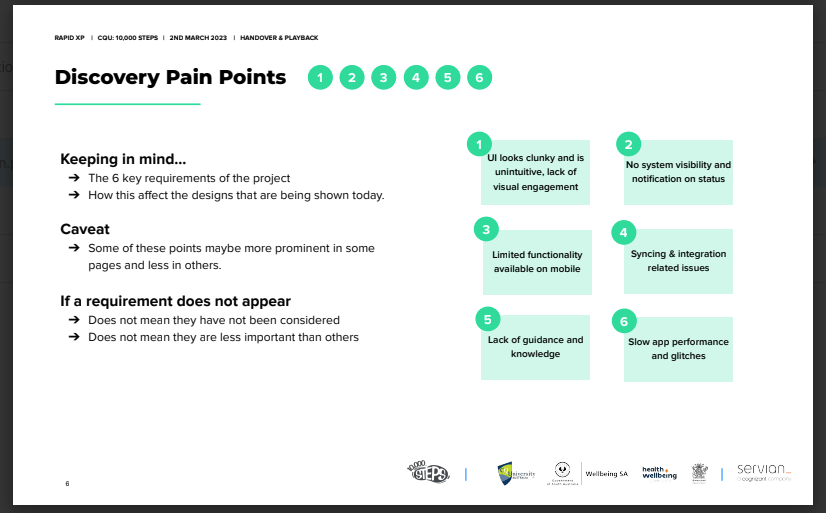
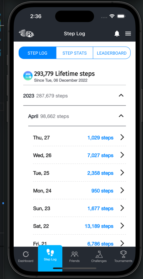
Mobile app users of 10,000 Steps rely on a combination of both the mobile app and the website as there is limited functionality on the mobile app. Users have also cited pain points such as a lack of instructional support when using the app and are seeking a more visually engaging mobile experience. The design team at Servian were asked to come in and help to refine and revamp the mobile application to better support and reassemble the website while delivering improved features to the program.
Discovery
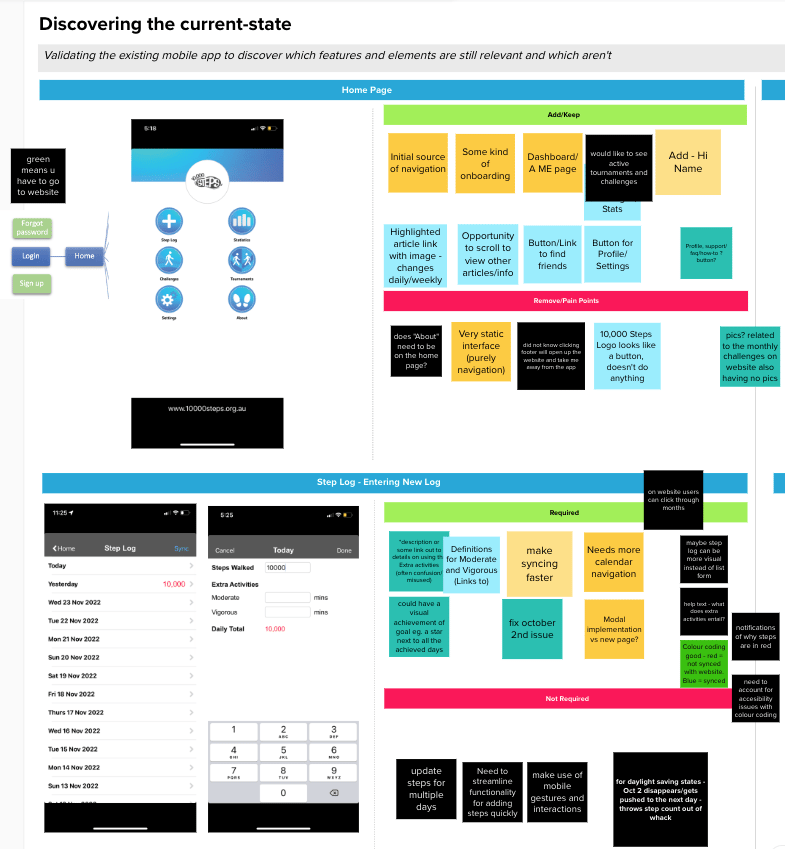
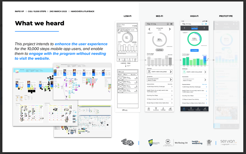
The discovery phase involved the team actioning a variety of user research methods such as user interviews, app user surveys and a series of workshops with different stakeholder groups to gather inputs and insights. As a result, we were able to develop key user personas that helped highlight key user pain points and goals that heavily informed the design direction for the app’s interface. All research outcomes were collated into a slide deck and played back to the client at the end of design discovery.
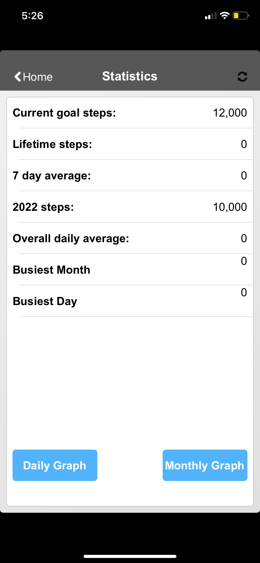
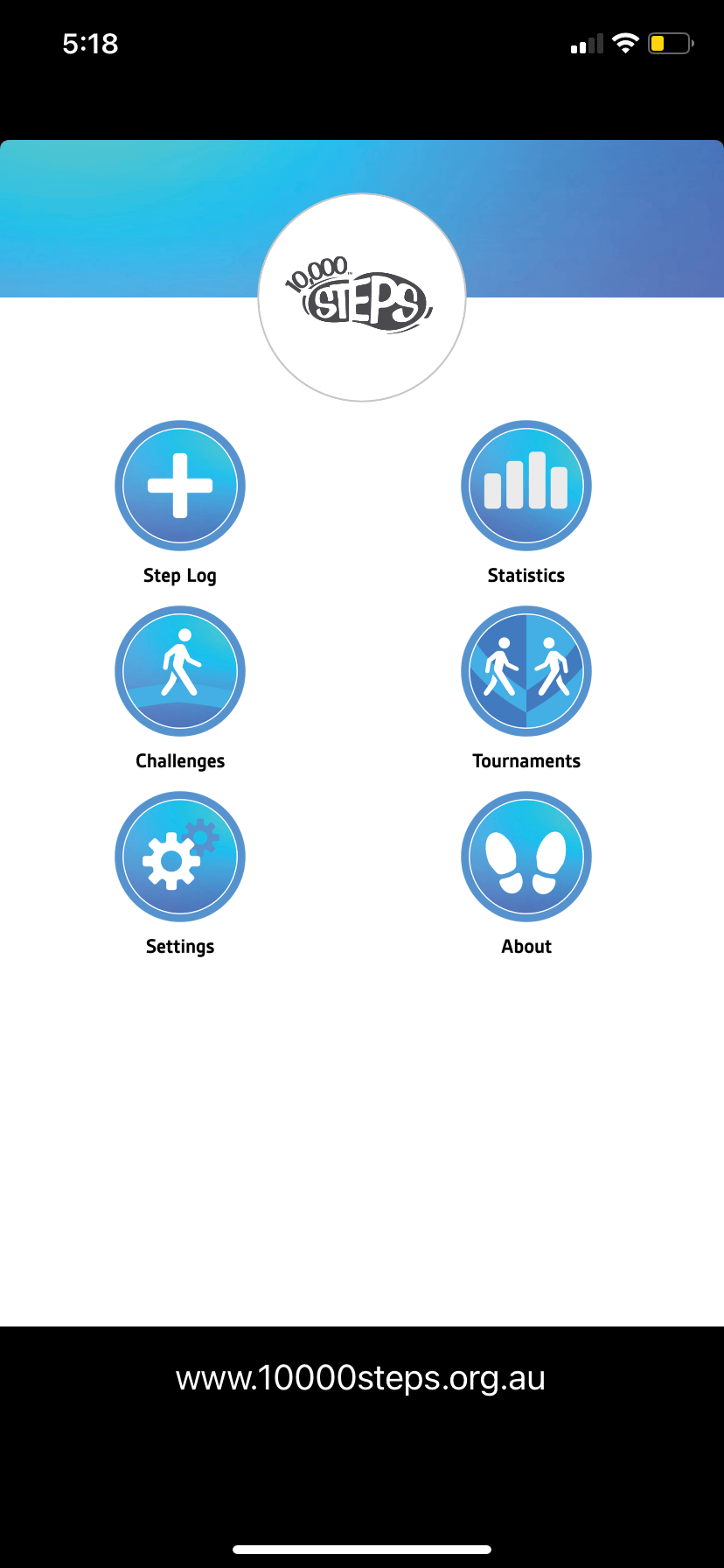
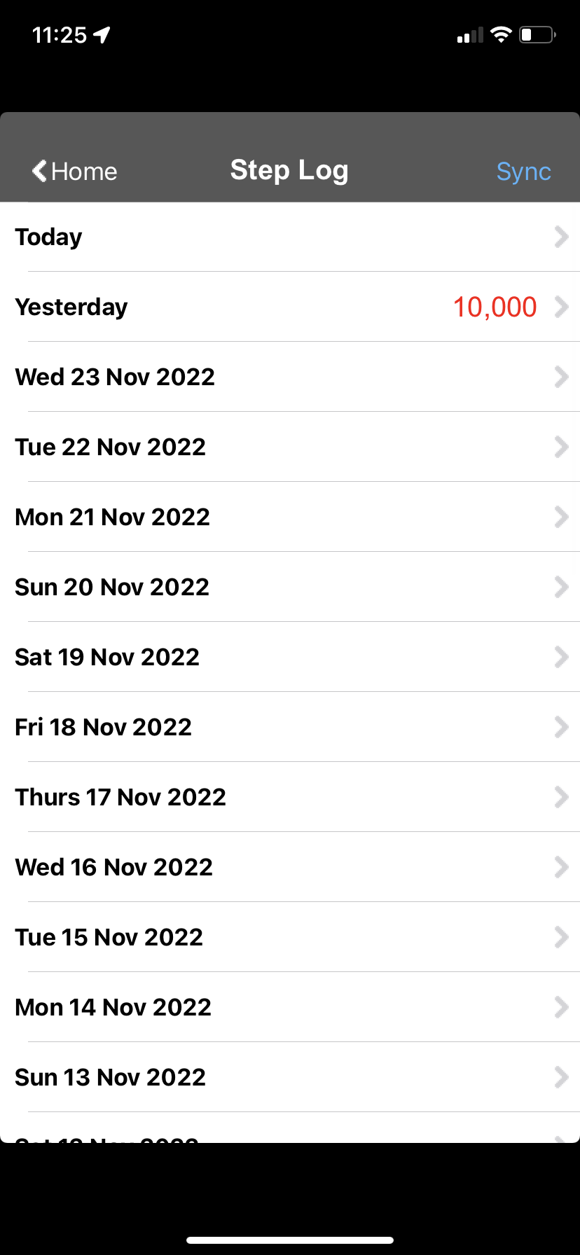
This relied on having stakeholders and users helping to identify along with the above how to streamline the application better for its intended use. By analysing the current user interface at the time of the workshop and addressing against the pain points, website interface and user/persona needs, the team was able to start working towards a future state. This future state would begin the transformation of the application to be a better user experience.
Co-Design
After establishing what the stakeholders were looking for in a future state for 10,000 Steps. They were invited to share their ideas on how this should be presented in Co-Design workshops. Stakeholders were presented with personas based on findings and feedback during the Discovery stage and asked to keep these archetypes in mind while coming up with ideas in the workshop.
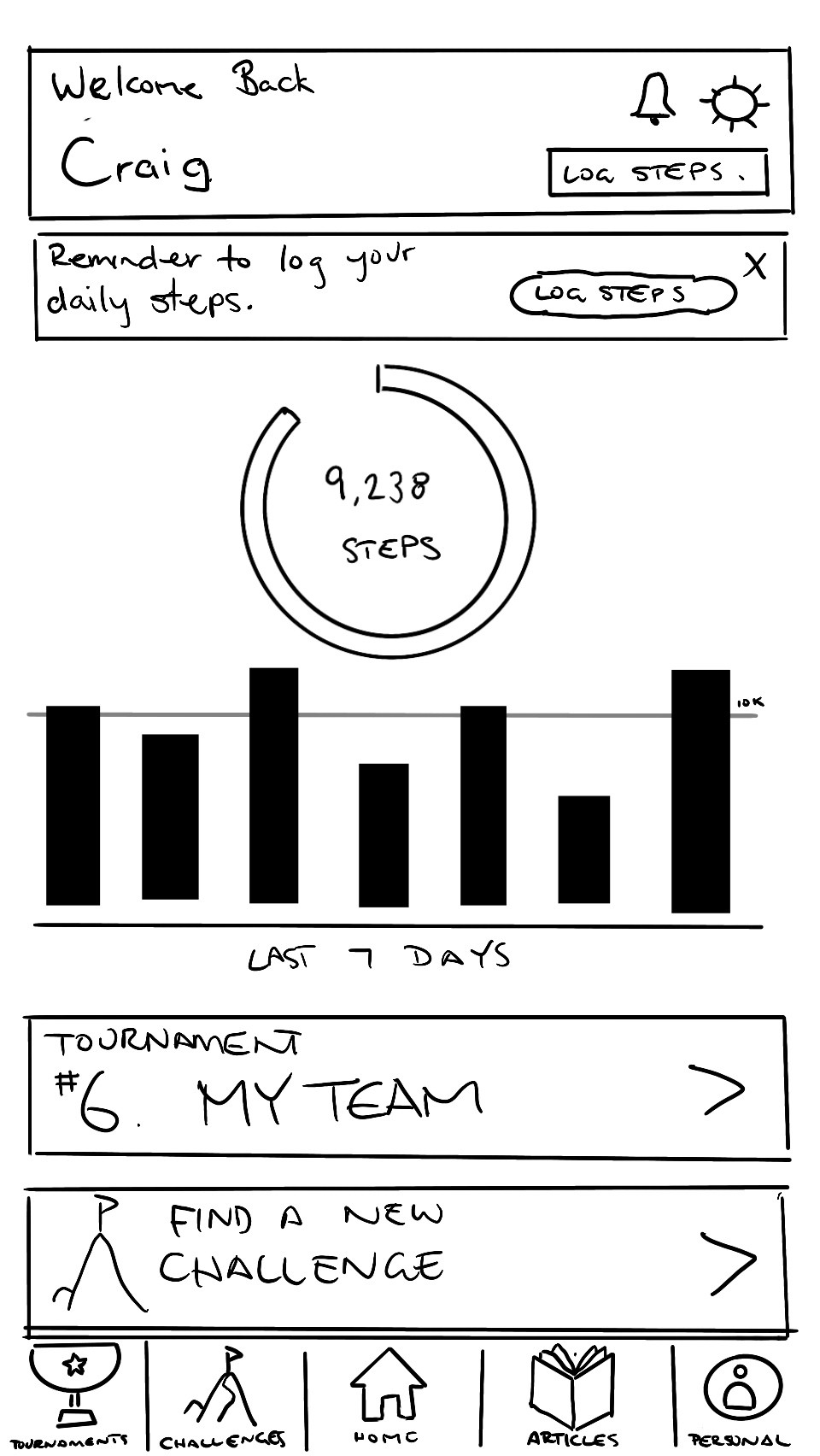
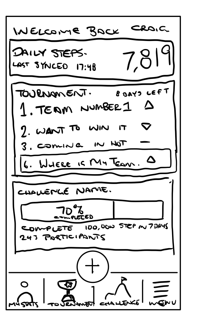
These initial designs were shared and collected for synthesising. This helped distil what the stakeholders were envisioning. These sketches were also annotated with key features and processes, that were then mapped into themes and features for the team to begin aligning their focus and priorities.
Feature Alignment
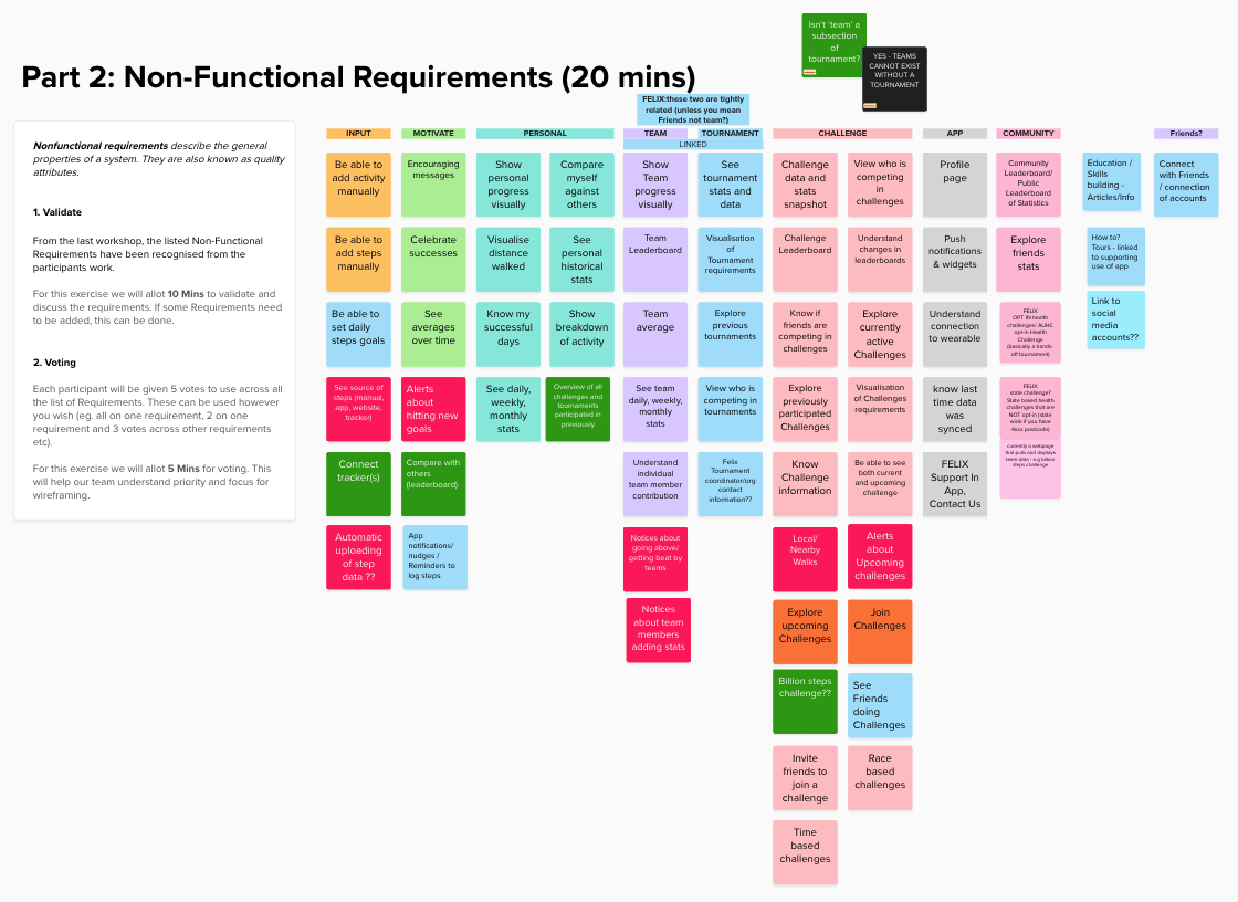
From gathering the themes and sketches from the previous workshop, the design team needed to dig a little deeper into the current state of the application with the knowledge of how the future state was forming.
The current user flow and application menu was analysed with the stakeholders to get input on how the personas can best achieve their goals and needs within 10,000 Steps. This process was complete live with the stakeholders so they could visually see the changes between current and future states and how the needs were being addressed.
Validation
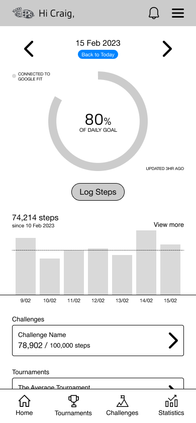
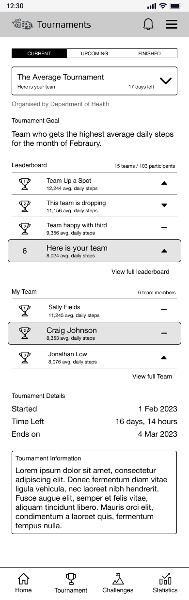
Taking the information forward, the design team began to correlate all our findings into low & mid fidelity wireframes based on confidence. Select screens and flow were prioritised based on needs and requirements. While coming up with concepts in this early stage, the reusability of elements being created was considered to help drive consistency throughout the application. Elements like leaderboards and rankings should have consistent and identifiable details across different flows to help reduce the user's cognitive load when trying to understand their status towards a goal.
While some flows required multiple steps and clicking through, we aimed to make sure that other important and key areas of the application were always accessible. This was added to the interface through global primary and secondary navigation. The benefit was to allow users to easily complete flow and see information relevant to them while being able to conveniently correct errors.
High-Fidelity Designs
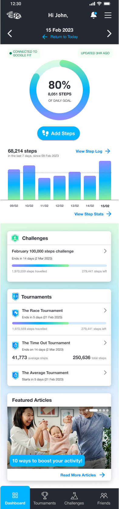
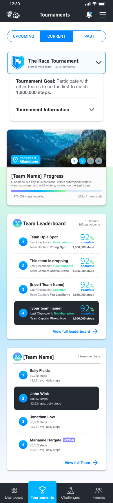
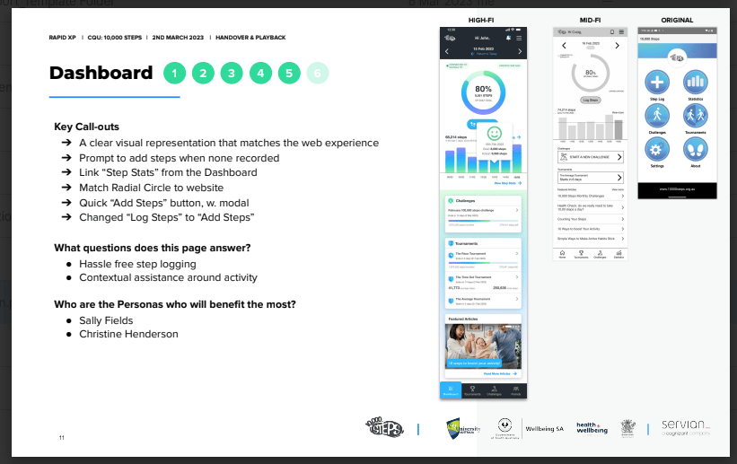
At this stage, the design team brought in more styling rules and started creating a design system for the application. This involved spacing rules, colour system, text styling and iconology sets to name a few. As per our recommendation, we leaned on the Material 3 UI Library to help speed up this process with making some alterations to fit for purpose within 10,000 Steps.
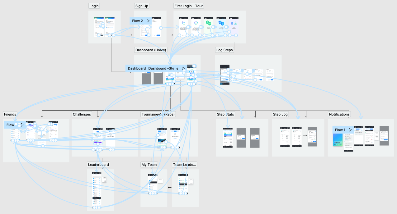
This stage also required the team to flesh out more pages with and without common assets to give a more complete picture of the final state of the redesign. Login/sign up screens and first login tour flow was created as part of these requirements helping new users quickly understand the application better.
When validating with the client, we displayed the current state and website view along with the future state to help convey and demonstrate the new intuitive flow. At times the current state was not currently existing and only the website was used. An interactive prototype was also created to show and demonstrate to the clients how each of the personas would achieve their goals.
Handover & Recommendations
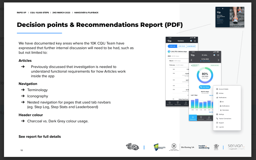
When wrapping up the client work for 10,000 Steps, the team presented the hi-fidelity prototypes, findings, validations, and future recommendations to the client. These artefacts were collected, presented to the 10,000 Steps in a final retrospective meeting and delivered to them for their records.
A large piece of the handover involved the high-fidelity designs and design system that was created during the engagement. As we begun to put together the design in Figma, a design system & library was constructed in parallel to help keep the consistency throughout the rest of the designs.
Although this may not sound like much, this is extremely beneficial to the client for their records and product development. The Future Recommendations document is our way of conveying the areas that weren’t highly prioritised or came out late in the process and how to improve on them. This document also helps the client understand other problems that we can help solve in the future.
Conclusion
Through the use of a framework and process created to help businesses identify goals and issues, collaborate and validate, the 10,000 Steps app was able to achieve a major usability overhaul. This gave the user’s of 10,000 Steps more functionality and visibility over goals, status and leaderboards.
While the initial discovery and findings were handled in Mural, allowing us to collaborate engagement with the client, we got to quickly gather and synthesise the data and thoughts. When we started redesigning the interface of 10,000 Steps, we recreated stakeholder sketches and wireframes in Figma to start building a visual language throughout the app. This was helped along with building a design system and library that allowed for quick iteration and validation to meet requirements easily.
While not everything was achievable during this engagement with the client, we have been able to suggest changes and help guide them through future planning with the assistance of a handover document.

Desk of Craig
10,000 Steps
How might we provide users a seamless mobile app experience that will enable them to enjoy the 10,000 steps program without having to navigate to the website?
What is 10,000 Steps?
10,000 Steps by Central Queensland University (CQU) is “a free physical activity program here to help you move more”.
10,000 Steps is a platform recognised around the world, providing support and encouragement to users looking to maintain or increase their activity levels. Jointly with businesses, councils and state departments they have established an active user base that utilise the platform to track their steps on a daily basis.
The application supports individuals, organisations and communities to incorporate more activity each day through evidence-based tools and resources. Pairing this with novel ways of goal-setting and encouragement through team based competitions, 10,000 Steps gives users an opportunity to track their activity differently.

What were we doing?
Mobile app users of 10,000 Steps rely on a combination of both the mobile app and the website as there is limited functionality on the mobile app. Users have also cited pain points such as a lack of instructional support when using the app and are seeking a more visually engaging mobile experience. The design team at Servian were asked to come in and help to refine and revamp the mobile application to better support and reassemble the website while delivering improved features to the program.
Discovery
The discovery phase involved the team actioning a variety of user research methods such as user interviews, app user surveys and a series of workshops with different stakeholder groups to gather inputs and insights. As a result, we were able to develop key user personas that helped highlight key user pain points and goals that heavily informed the design direction for the app’s interface. All research outcomes were collated into a slide deck and played back to the client at the end of design discovery.
This relied on having stakeholders and users helping to identify along with the above how to streamline the application better for its intended use. By analysing the current user interface at the time of the workshop and addressing against the pain points, website interface and user/persona needs, the team was able to start working towards a future state. This future state would begin the transformation of the application to be a better user experience.
Co-Design
After establishing what the stakeholders were looking for in a future state for 10,000 Steps. They were invited to share their ideas on how this should be presented in Co-Design workshops. Stakeholders were presented with personas based on findings and feedback during the Discovery stage and asked to keep these archetypes in mind while coming up with ideas in the workshop.
These initial designs were shared and collected for synthesising. This helped distil what the stakeholders were envisioning. These sketches were also annotated with key features and processes, that were then mapped into themes and features for the team to begin aligning their focus and priorities.
Feature Alignment
From gathering the themes and sketches from the previous workshop, the design team needed to dig a little deeper into the current state of the application with the knowledge of how the future state was forming.
The current user flow and application menu was analysed with the stakeholders to get input on how the personas can best achieve their goals and needs within 10,000 Steps. This process was complete live with the stakeholders so they could visually see the changes between current and future states and how the needs were being addressed.
Validation
Taking the information forward, the design team began to correlate all our findings into low & mid fidelity wireframes based on confidence. Select screens and flow were prioritised based on needs and requirements. While coming up with concepts in this early stage, the reusability of elements being created was considered to help drive consistency throughout the application. Elements like leaderboards and rankings should have consistent and identifiable details across different flows to help reduce the user's cognitive load when trying to understand their status towards a goal.
While some flows required multiple steps and clicking through, we aimed to make sure that other important and key areas of the application were always accessible. This was added to the interface through global primary and secondary navigation. The benefit was to allow users to easily complete flow and see information relevant to them while being able to conveniently correct errors.
High-Fidelity Designs
At this stage, the design team brought in more styling rules and started creating a design system for the application. This involved spacing rules, colour system, text styling and iconology sets to name a few. As per our recommendation, we leaned on the Material 3 UI Library to help speed up this process with making some alterations to fit for purpose within 10,000 Steps.
This stage also required the team to flesh out more pages with and without common assets to give a more complete picture of the final state of the redesign. Login/sign up screens and first login tour flow was created as part of these requirements helping new users quickly understand the application better.
When validating with the client, we displayed the current state and website view along with the future state to help convey and demonstrate the new intuitive flow. At times the current state was not currently existing and only the website was used. An interactive prototype was also created to show and demonstrate to the clients how each of the personas would achieve their goals.
Handover & Recommendations
When wrapping up the client work for 10,000 Steps, the team presented the hi-fidelity prototypes, findings, validations, and future recommendations to the client. These artefacts were collected, presented to the 10,000 Steps in a final retrospective meeting and delivered to them for their records.
A large piece of the handover involved the high-fidelity designs and design system that was created during the engagement. As we begun to put together the design in Figma, a design system & library was constructed in parallel to help keep the consistency throughout the rest of the designs.
Although this may not sound like much, this is extremely beneficial to the client for their records and product development. The Future Recommendations document is our way of conveying the areas that weren’t highly prioritised or came out late in the process and how to improve on them. This document also helps the client understand other problems that we can help solve in the future.
Conclusion
Through the use of a framework and process created to help businesses identify goals and issues, collaborate and validate, the 10,000 Steps app was able to achieve a major usability overhaul. This gave the user’s of 10,000 Steps more functionality and visibility over goals, status and leaderboards.
While the initial discovery and findings were handled in Mural, allowing us to collaborate engagement with the client, we got to quickly gather and synthesise the data and thoughts. When we started redesigning the interface of 10,000 Steps, we recreated stakeholder sketches and wireframes in Figma to start building a visual language throughout the app. This was helped along with building a design system and library that allowed for quick iteration and validation to meet requirements easily.
While not everything was achievable during this engagement with the client, we have been able to suggest changes and help guide them through future planning with the assistance of a handover document.
Desk of Craig
10,000 Steps
How might we provide users a seamless mobile app experience that will enable them to enjoy the 10,000 steps program without having to navigate to the website?
What is 10,000 Steps?
10,000 Steps by Central Queensland University (CQU) is “a free physical activity program here to help you move more”.
10,000 Steps is a platform recognised around the world, providing support and encouragement to users looking to maintain or increase their activity levels. Jointly with businesses, councils and state departments they have established an active user base that utilise the platform to track their steps on a daily basis.
The application supports individuals, organisations and communities to incorporate more activity each day through evidence-based tools and resources. Pairing this with novel ways of goal-setting and encouragement through team based competitions, 10,000 Steps gives users an opportunity to track their activity differently.
What were we doing?
Mobile app users of 10,000 Steps rely on a combination of both the mobile app and the website as there is limited functionality on the mobile app. Users have also cited pain points such as a lack of instructional support when using the app and are seeking a more visually engaging mobile experience. The design team at Servian were asked to come in and help to refine and revamp the mobile application to better support and reassemble the website while delivering improved features to the program.
Discovery
The discovery phase involved the team actioning a variety of user research methods such as user interviews, app user surveys and a series of workshops with different stakeholder groups to gather inputs and insights. As a result, we were able to develop key user personas that helped highlight key user pain points and goals that heavily informed the design direction for the app’s interface. All research outcomes were collated into a slide deck and played back to the client at the end of design discovery.
This relied on having stakeholders and users helping to identify along with the above how to streamline the application better for its intended use. By analysing the current user interface at the time of the workshop and addressing against the pain points, website interface and user/persona needs, the team was able to start working towards a future state. This future state would begin the transformation of the application to be a better user experience.
Co-Design
After establishing what the stakeholders were looking for in a future state for 10,000 Steps. They were invited to share their ideas on how this should be presented in Co-Design workshops. Stakeholders were presented with personas based on findings and feedback during the Discovery stage and asked to keep these archetypes in mind while coming up with ideas in the workshop.
These initial designs were shared and collected for synthesising. This helped distil what the stakeholders were envisioning. These sketches were also annotated with key features and processes, that were then mapped into themes and features for the team to begin aligning their focus and priorities.
Feature Alignment
From gathering the themes and sketches from the previous workshop, the design team needed to dig a little deeper into the current state of the application with the knowledge of how the future state was forming.
The current user flow and application menu was analysed with the stakeholders to get input on how the personas can best achieve their goals and needs within 10,000 Steps. This process was complete live with the stakeholders so they could visually see the changes between current and future states and how the needs were being addressed.
Validation
Taking the information forward, the design team began to correlate all our findings into low & mid fidelity wireframes based on confidence. Select screens and flow were prioritised based on needs and requirements. While coming up with concepts in this early stage, the reusability of elements being created was considered to help drive consistency throughout the application. Elements like leaderboards and rankings should have consistent and identifiable details across different flows to help reduce the user's cognitive load when trying to understand their status towards a goal.
While some flows required multiple steps and clicking through, we aimed to make sure that other important and key areas of the application were always accessible. This was added to the interface through global primary and secondary navigation. The benefit was to allow users to easily complete flow and see information relevant to them while being able to conveniently correct errors.
High-Fidelity Designs
At this stage, the design team brought in more styling rules and started creating a design system for the application. This involved spacing rules, colour system, text styling and iconology sets to name a few. As per our recommendation, we leaned on the Material 3 UI Library to help speed up this process with making some alterations to fit for purpose within 10,000 Steps.
This stage also required the team to flesh out more pages with and without common assets to give a more complete picture of the final state of the redesign. Login/sign up screens and first login tour flow was created as part of these requirements helping new users quickly understand the application better.
When validating with the client, we displayed the current state and website view along with the future state to help convey and demonstrate the new intuitive flow. At times the current state was not currently existing and only the website was used. An interactive prototype was also created to show and demonstrate to the clients how each of the personas would achieve their goals.
Handover & Recommendations
When wrapping up the client work for 10,000 Steps, the team presented the hi-fidelity prototypes, findings, validations, and future recommendations to the client. These artefacts were collected, presented to the 10,000 Steps in a final retrospective meeting and delivered to them for their records.
A large piece of the handover involved the high-fidelity designs and design system that was created during the engagement. As we begun to put together the design in Figma, a design system & library was constructed in parallel to help keep the consistency throughout the rest of the designs.
Although this may not sound like much, this is extremely beneficial to the client for their records and product development. The Future Recommendations document is our way of conveying the areas that weren’t highly prioritised or came out late in the process and how to improve on them. This document also helps the client understand other problems that we can help solve in the future.
Conclusion
Through the use of a framework and process created to help businesses identify goals and issues, collaborate and validate, the 10,000 Steps app was able to achieve a major usability overhaul. This gave the user’s of 10,000 Steps more functionality and visibility over goals, status and leaderboards.
While the initial discovery and findings were handled in Mural, allowing us to collaborate engagement with the client, we got to quickly gather and synthesise the data and thoughts. When we started redesigning the interface of 10,000 Steps, we recreated stakeholder sketches and wireframes in Figma to start building a visual language throughout the app. This was helped along with building a design system and library that allowed for quick iteration and validation to meet requirements easily.
While not everything was achievable during this engagement with the client, we have been able to suggest changes and help guide them through future planning with the assistance of a handover document.