
Desk of Craig

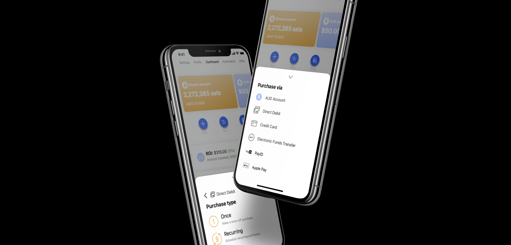
A case study from my time working at Amber Labs Pty Ltd
Universal Payment Method Selection
Solving the problem of adapting to multiple payment methods in a variety of jurisdictions.
The Problem & Goals
As a rapidly expanding application, Amber wished to grow its user-base outside of Australia. Being based in Australia, the team is familiar with what payment methods and infrastructure are possible to implement into the product. Australia also has some unique payment methods that are not available in other parts of the world, PayID being a standout. Each jurisdiction, whether it was country or continental, varied in how its citizens chose to move money between individuals and services.
For the user
Each user has their preferred method of transacting funds between bank accounts and services. Adding to this, depending on the user’s geographic location, their options will change. When looking at making purchases of Bitcoin or depositing fiat currency into Amber, it is beneficial for the user to remain aware of the previous selections. This information can also be fed back to the user at later steps.
For the business
Amber needed a way that would allow the business to easily adapt a base product for a variety of payment methods and services that differ between jurisdictions. This solution needed to continue in the business’ mission of “making bitcoin easy” by allowing a procedure that made sure the user experience would be improved from the previous interface.
The Current Experience
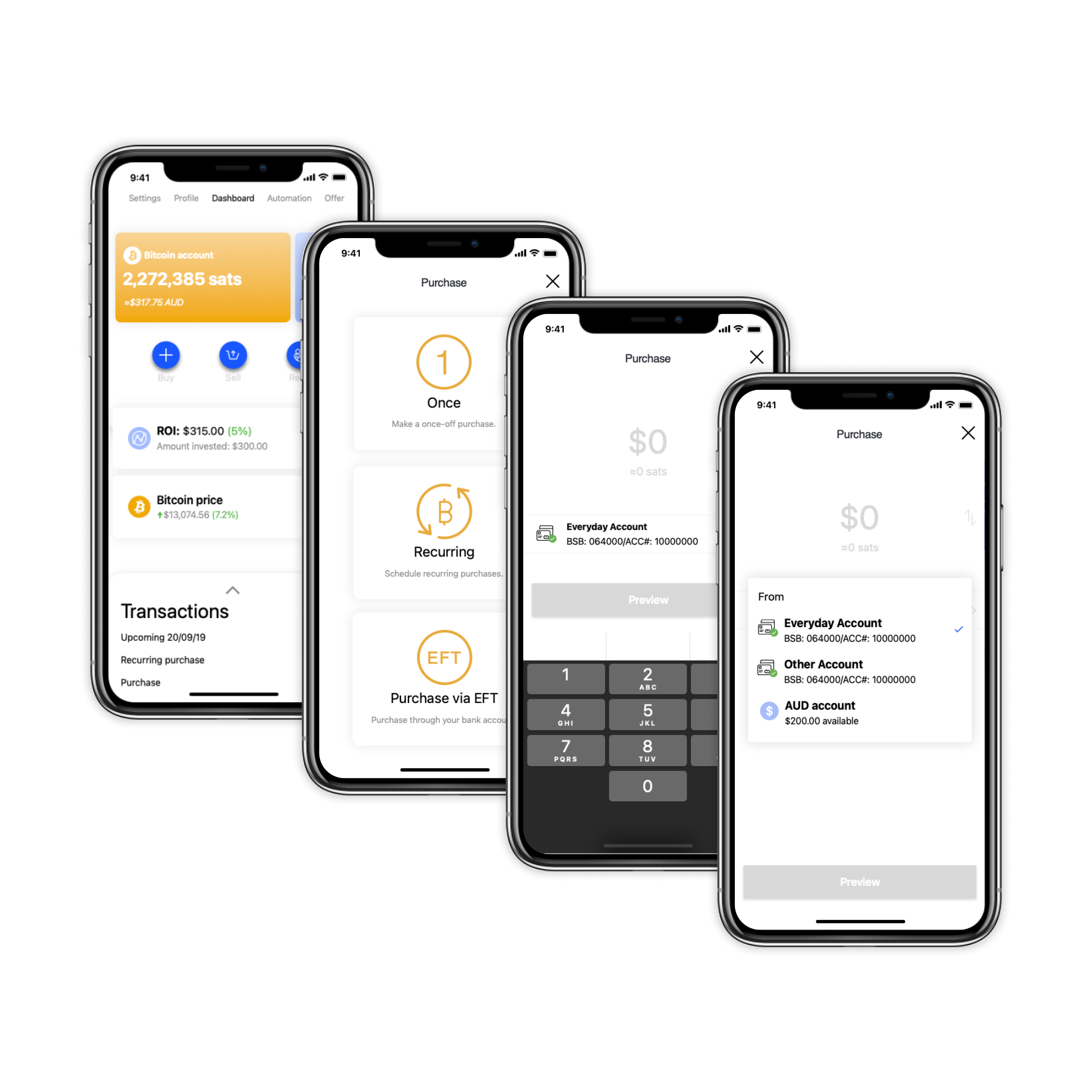
The current method for the user to select their desired payment method slowed their experience down. Changing from a default payment method was only achievable once the user was on the purchasing screen. And even that was additional steps the user had to complete.
Moving forward, Amber needed to have a way that made the made the purchasing experience much cheaper for the user, while also making it more adaptable for the business.
Needs Analysis
Requirements
The solution had to be able to contain many different payments methods. This would also need to change in each jurisdiction with the possibility of some crossover. An example of this is credit card payments being available in almost all jurisdictions.
The options for payment types were to be considered in this solution. This would aim to make the solution flow better and all appear as one flow.
Users can have the same experience in the app anywhere in the world, regardless of jurisdiction and payment methods available.
- Amber can assign payment methods to a jurisdiction.
- Users can only see payment methods in their jurisdictions.
- Users cognitive load to be minimal.
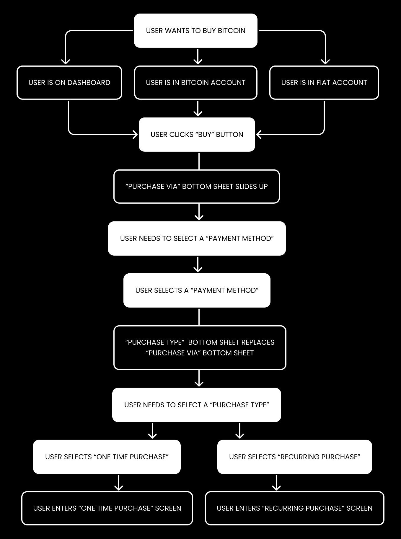
Updated User Journey
Amber was created to be a simple and easy onramp allowing its user to buy, hold and accumulate Bitcoin. This has meant that Bitcoin purchasing methods need to suit the user’s individual needs and letting them use what they are familiar with using.
In Australia, the payment methods available are different from what is available in the United States of America. Some methods are similar but with differences changing how the infrastructure works.
Design & Testing
Initial Concepts
The previous interface had broken the selection of payment method up from the purchase type in a way that would remove the user from their previous action. This, at times, made it difficult for users to make their next decision in the user flow.
A redesign of the user flow based on user feedback, surveying and investigation was completed to help understand the user's decision making process better than Amber had previously thought.
The new purchasing flow was to build on top of a lot of the current interface of the product. This means that some major parts will be staying untouched. For example, the dashboard, Bitcoin account and Fiat account screens. Changes to API calls were to be kept to what had been currently implemented to limit extra work by developers.
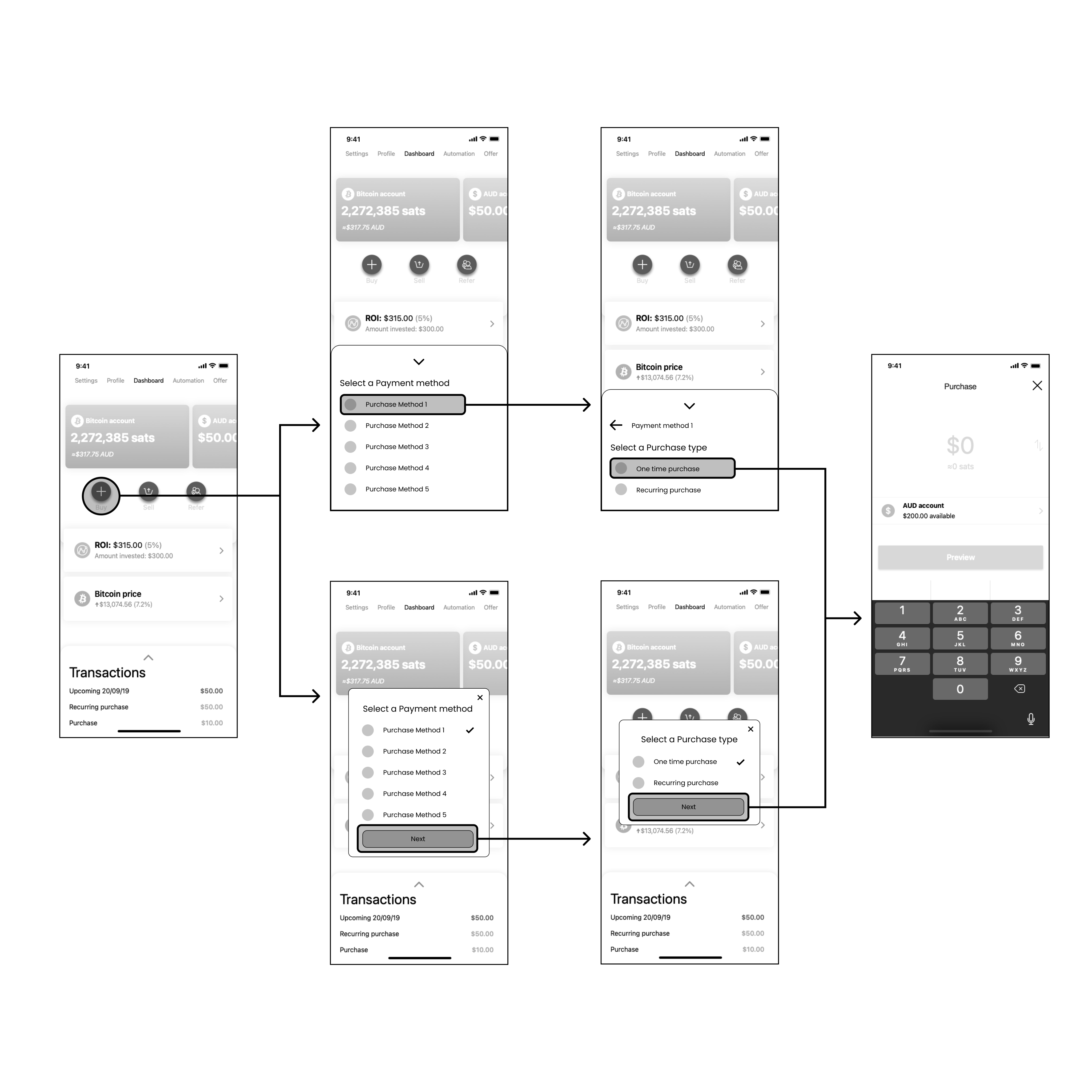
Having a new user flow and journey mapped out. Amber looked into how to lead the user through a purchasing journey without having them removed from a previous action too soon. A number of possible concepts were put forward to users as wireframes for A/B testing. While not forgetting the original goal of making product expansion easier, this gave the team insight into what worked best for users for selecting a payment method for purchasing Bitcoin.
Early Findings
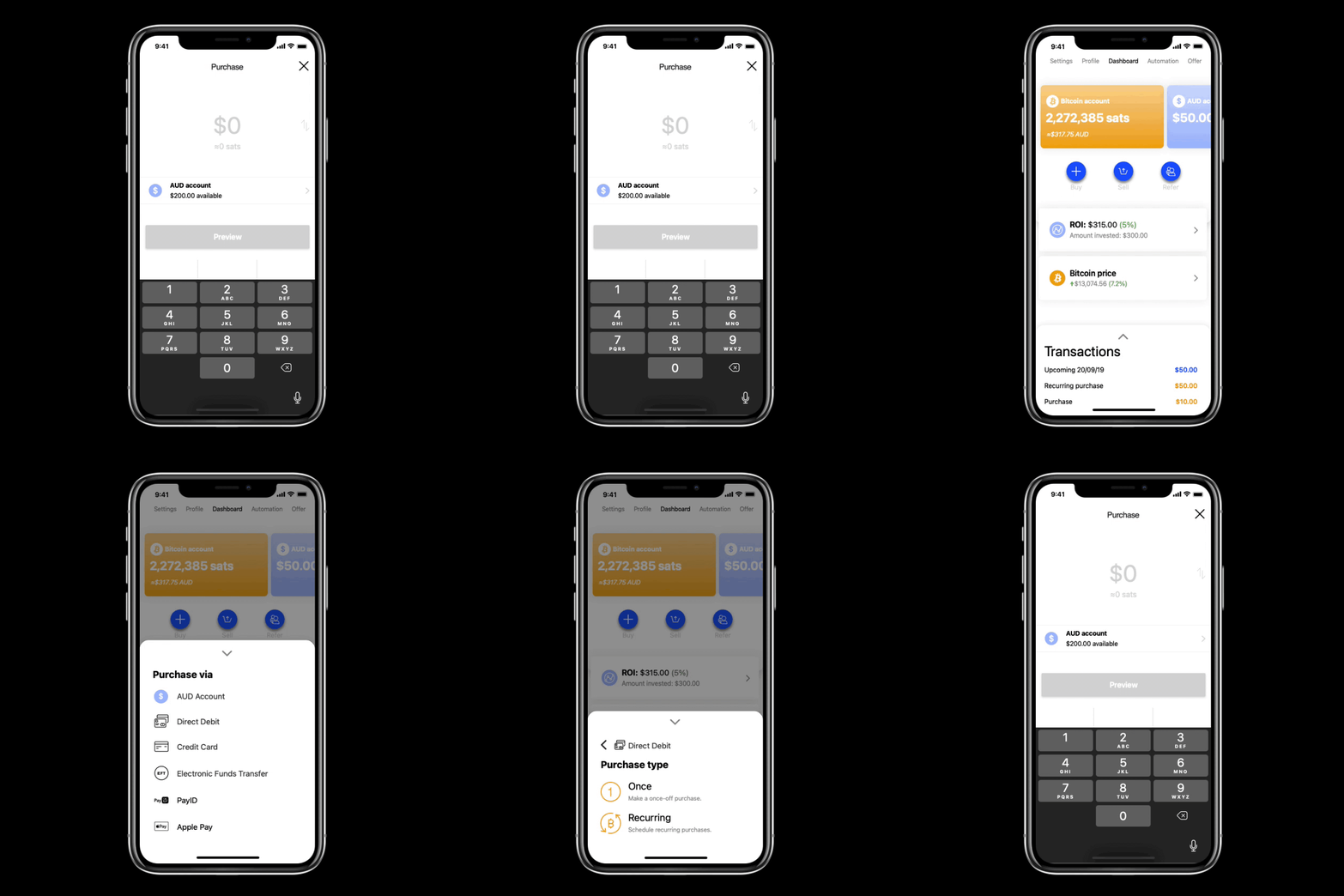
Research into current design components showed that the “bottom sheet” was becoming more popular for user interaction on a mobile device. This was because modal and alert pop-ups are limited to what can be designed for them. Bottom sheet components have greater flexibility in design and development and not as jarring to users as a pop-up.
The updates to the payment method and purchase type selections were taken well by testers and stakeholders allowing for a more convenient experience. By making the payment method selection more apparent than previous designs, the user felt more confident when completing purchases.
Protoyping
Using Figma, quick prototypes were built to test and refine the user experience and interface. This was given to the testers internally and externally with instructions based on the journey we were looking for users to complete. In this instance, it was to select a payment method and payment type for purchasing Bitcoin.
With the feedback from the first lot of testing, changes to interactions and placements were made. The new interface was also extended to other payment methods for deposits. The goal was to make the transaction for funds into Amber as consistent as possible, whether it was purchasing Bitcoin, or deposited fiat currency into the app. Most of the time this was achievable through the same payment methods with the destination changing.
Conclusion
The order in which procedures are completed can greatly improve the user experience. This statement is also relevant in terms of how a process is delivered to a user in steps for completion. This is in no way dumbing down a flow, but making sure the users goal is successful through clear steps.
From the original to the updated flow, the interface gives the user more identifiable actions when making a purchase. Previously users were not able to change their payment method until on the purchase screen. This could lead to a risk of when completing a purchase, it maybe confirmed with the wrong payment method.
Now when arriving at the purchasing screen to enter a purchase amount, all relevant payment method and funding info as already been selected by the user. Each bottom sheet and screen now contains one primary action from the user, also reducing the cognitive load.
The process may have an extra step compared to the original but offers a much cleaner and thought out experience.

Desk of Craig
A case study from my time working at Amber Labs Pty Ltd
Universal Payment Method Selection
Solving the problem of adapting to multiple payment methods in a variety of jurisdictions.
The Problem & Goals
As a rapidly expanding application, Amber wished to grow its user-base outside of Australia. Being based in Australia, the team is familiar with what payment methods and infrastructure are possible to implement into the product. Australia also has some unique payment methods that are not available in other parts of the world, PayID being a standout. Each jurisdiction, whether it was country or continental, varied in how its citizens chose to move money between individuals and services.
For the user
Each user has their preferred method of transacting funds between bank accounts and services. Adding to this, depending on the user’s geographic location, their options will change. When looking at making purchases of Bitcoin or depositing fiat currency into Amber, it is beneficial for the user to remain aware of the previous selections. This information can also be fed back to the user at later steps.
For the business
Amber needed a way that would allow the business to easily adapt a base product for a variety of payment methods and services that differ between jurisdictions. This solution needed to continue in the business’ mission of “making bitcoin easy” by allowing a procedure that made sure the user experience would be improved from the previous interface.
The Current Experience
The current method for the user to select their desired payment method slowed their experience down. Changing from a default payment method was only achievable once the user was on the purchasing screen. And even that was additional steps the user had to complete.
Moving forward, Amber needed to have a way that made the made the purchasing experience much cheaper for the user, while also making it more adaptable for the business.
Needs Analysis
Requirements
The solution had to be able to contain many different payments methods. This would also need to change in each jurisdiction with the possibility of some crossover. An example of this is credit card payments being available in almost all jurisdictions.
The options for payment types were to be considered in this solution. This would aim to make the solution flow better and all appear as one flow.
Users can have the same experience in the app anywhere in the world, regardless of jurisdiction and payment methods available.
- Amber can assign payment methods to a jurisdiction.
- Users can only see payment methods in their jurisdictions.
- Users cognitive load to be minimal.
Updated User Journey
Amber was created to be a simple and easy onramp allowing its user to buy, hold and accumulate Bitcoin. This has meant that Bitcoin purchasing methods need to suit the user’s individual needs and letting them use what they are familiar with using.
In Australia, the payment methods available are different from what is available in the United States of America. Some methods are similar but with differences changing how the infrastructure works.
Design & Testing
Initial Concepts
The previous interface had broken the selection of payment method up from the purchase type in a way that would remove the user from their previous action. This, at times, made it difficult for users to make their next decision in the user flow.
A redesign of the user flow based on user feedback, surveying and investigation was completed to help understand the user's decision making process better than Amber had previously thought.
The new purchasing flow was to build on top of a lot of the current interface of the product. This means that some major parts will be staying untouched. For example, the dashboard, Bitcoin account and Fiat account screens. Changes to API calls were to be kept to what had been currently implemented to limit extra work by developers.
Having a new user flow and journey mapped out. Amber looked into how to lead the user through a purchasing journey without having them removed from a previous action too soon. A number of possible concepts were put forward to users as wireframes for A/B testing. While not forgetting the original goal of making product expansion easier, this gave the team insight into what worked best for users for selecting a payment method for purchasing Bitcoin.
Early Findings
Research into current design components showed that the “bottom sheet” was becoming more popular for user interaction on a mobile device. This was because modal and alert pop-ups are limited to what can be designed for them. Bottom sheet components have greater flexibility in design and development and not as jarring to users as a pop-up.
The updates to the payment method and purchase type selections were taken well by testers and stakeholders allowing for a more convenient experience. By making the payment method selection more apparent than previous designs, the user felt more confident when completing purchases.
Protoyping
Using Figma, quick prototypes were built to test and refine the user experience and interface. This was given to the testers internally and externally with instructions based on the journey we were looking for users to complete. In this instance, it was to select a payment method and payment type for purchasing Bitcoin.
With the feedback from the first lot of testing, changes to interactions and placements were made. The new interface was also extended to other payment methods for deposits. The goal was to make the transaction for funds into Amber as consistent as possible, whether it was purchasing Bitcoin, or deposited fiat currency into the app. Most of the time this was achievable through the same payment methods with the destination changing.
Conclusion
The order in which procedures are completed can greatly improve the user experience. This statement is also relevant in terms of how a process is delivered to a user in steps for completion. This is in no way dumbing down a flow, but making sure the users goal is successful through clear steps.
From the original to the updated flow, the interface gives the user more identifiable actions when making a purchase. Previously users were not able to change their payment method until on the purchase screen. This could lead to a risk of when completing a purchase, it maybe confirmed with the wrong payment method.
Now when arriving at the purchasing screen to enter a purchase amount, all relevant payment method and funding info as already been selected by the user. Each bottom sheet and screen now contains one primary action from the user, also reducing the cognitive load.
The process may have an extra step compared to the original but offers a much cleaner and thought out experience.
Desk of Craig
A case study from my time working at Amber Labs Pty Ltd
Universal Payment Method Selection
Solving the problem of adapting to multiple payment methods in a variety of jurisdictions.
The Problem & Goals
As a rapidly expanding application, Amber wished to grow its user-base outside of Australia. Being based in Australia, the team is familiar with what payment methods and infrastructure are possible to implement into the product. Australia also has some unique payment methods that are not available in other parts of the world, PayID being a standout. Each jurisdiction, whether it was country or continental, varied in how its citizens chose to move money between individuals and services.
For the user
Each user has their preferred method of transacting funds between bank accounts and services. Adding to this, depending on the user’s geographic location, their options will change. When looking at making purchases of Bitcoin or depositing fiat currency into Amber, it is beneficial for the user to remain aware of the previous selections. This information can also be fed back to the user at later steps.
For the business
Amber needed a way that would allow the business to easily adapt a base product for a variety of payment methods and services that differ between jurisdictions. This solution needed to continue in the business’ mission of “making bitcoin easy” by allowing a procedure that made sure the user experience would be improved from the previous interface.
The Current Experience
The current method for the user to select their desired payment method slowed their experience down. Changing from a default payment method was only achievable once the user was on the purchasing screen. And even that was additional steps the user had to complete.
Moving forward, Amber needed to have a way that made the made the purchasing experience much cheaper for the user, while also making it more adaptable for the business.
Needs Analysis
Requirements
The solution had to be able to contain many different payments methods. This would also need to change in each jurisdiction with the possibility of some crossover. An example of this is credit card payments being available in almost all jurisdictions.
The options for payment types were to be considered in this solution. This would aim to make the solution flow better and all appear as one flow.
Users can have the same experience in the app anywhere in the world, regardless of jurisdiction and payment methods available.
- Amber can assign payment methods to a jurisdiction.
- Users can only see payment methods in their jurisdictions.
- Users cognitive load to be minimal.
Updated User Journey
Amber was created to be a simple and easy onramp allowing its user to buy, hold and accumulate Bitcoin. This has meant that Bitcoin purchasing methods need to suit the user’s individual needs and letting them use what they are familiar with using.
In Australia, the payment methods available are different from what is available in the United States of America. Some methods are similar but with differences changing how the infrastructure works.
Design & Testing
Initial Concepts
The previous interface had broken the selection of payment method up from the purchase type in a way that would remove the user from their previous action. This, at times, made it difficult for users to make their next decision in the user flow.
A redesign of the user flow based on user feedback, surveying and investigation was completed to help understand the user's decision making process better than Amber had previously thought.
The new purchasing flow was to build on top of a lot of the current interface of the product. This means that some major parts will be staying untouched. For example, the dashboard, Bitcoin account and Fiat account screens. Changes to API calls were to be kept to what had been currently implemented to limit extra work by developers.
Having a new user flow and journey mapped out. Amber looked into how to lead the user through a purchasing journey without having them removed from a previous action too soon. A number of possible concepts were put forward to users as wireframes for A/B testing. While not forgetting the original goal of making product expansion easier, this gave the team insight into what worked best for users for selecting a payment method for purchasing Bitcoin.
Early Findings
Research into current design components showed that the “bottom sheet” was becoming more popular for user interaction on a mobile device. This was because modal and alert pop-ups are limited to what can be designed for them. Bottom sheet components have greater flexibility in design and development and not as jarring to users as a pop-up.
The updates to the payment method and purchase type selections were taken well by testers and stakeholders allowing for a more convenient experience. By making the payment method selection more apparent than previous designs, the user felt more confident when completing purchases.
Protoyping
Using Figma, quick prototypes were built to test and refine the user experience and interface. This was given to the testers internally and externally with instructions based on the journey we were looking for users to complete. In this instance, it was to select a payment method and payment type for purchasing Bitcoin.
With the feedback from the first lot of testing, changes to interactions and placements were made. The new interface was also extended to other payment methods for deposits. The goal was to make the transaction for funds into Amber as consistent as possible, whether it was purchasing Bitcoin, or deposited fiat currency into the app. Most of the time this was achievable through the same payment methods with the destination changing.
Conclusion
The order in which procedures are completed can greatly improve the user experience. This statement is also relevant in terms of how a process is delivered to a user in steps for completion. This is in no way dumbing down a flow, but making sure the users goal is successful through clear steps.
From the original to the updated flow, the interface gives the user more identifiable actions when making a purchase. Previously users were not able to change their payment method until on the purchase screen. This could lead to a risk of when completing a purchase, it maybe confirmed with the wrong payment method.
Now when arriving at the purchasing screen to enter a purchase amount, all relevant payment method and funding info as already been selected by the user. Each bottom sheet and screen now contains one primary action from the user, also reducing the cognitive load.
The process may have an extra step compared to the original but offers a much cleaner and thought out experience.